Design
Tune the visual style used in the portal and plugin.
Portal configuration
Design controls how the customer experience feels across portal and plugin surfaces.
Use the preview to check readability, brand fit, and mobile behavior before publishing changes.
Open Content, open the settings menu, and choose Design. The Design dialog controls branding and layout used in the portal and plugin.
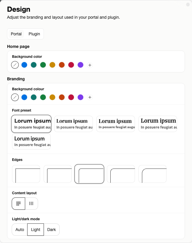
Use the Design dialog to check logo, colors, typography, card style, and light or dark mode before customers see the portal or plugin.
Design Controls
- Home background
- Branding color
- Text color
- Font preset
- Edge style
- Cards or list
- Light or dark mode
Check the design as a customer would. Make sure the logo is readable, buttons stand out, and content cards work on mobile as well as desktop. The design form helps prevent unreadable color combinations by checking text contrast where needed.
Good Practice
Match your website closely enough that the portal and plugin feel trustworthy, but keep actions easy to identify. If a color looks good in a brand guide but makes buttons hard to read, choose readability.
Plan and Role Notes
Branding is available on eligible paid plans. On Free, Sparki branding stays visible.
Members need Edit portal settings to change Design.